
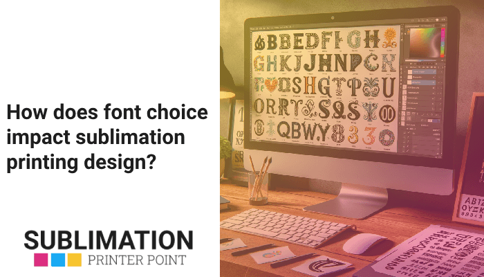
Discover the important function that typography plays in the sublimation printing industry. This comprehensive guide walks readers through the subtleties of font selection, the power of color theory, and the importance of font licensing in creating eye-catching designs.
Beyond only making text readable, typography has an impact on brand messaging and design aesthetics in sublimation printing. The efficacy and visual attractiveness of a design can be strongly influenced by the digital font selection. While color theory directs the construction of balanced, powerful designs, vector graphics guarantee high-quality, scalable designs. To ensure the ethical usage of typefaces, font licensing is an essential legal consideration. Text effects give depth and visual intrigue, while custom font design enables the creation of distinctive, individualized designs. Using design templates makes following font license guidelines easier.
- Typography is a crucial element in sublimation printing, influencing design aesthetics and brand messaging.
- Choice of digital fonts significantly impacts design’s visual appeal and effectiveness.
- Vector graphics ensure high-quality, scalable designs.
- Color theory guides the creation of balanced, impactful designs.
- Font licensing is a crucial legal aspect, ensuring ethical use of typefaces.
- Custom font design allows for unique, personalized designs.
- Text effects add depth and visual interest to designs.
- Design templates can simplify adherence to font licensing rules.
What is the role of typography in sublimation printing?
The skill of arranging type, or typography, is essential to sublimation printing. It’s important to communicate a message and elicit an emotional reaction in addition to making words readable. When it comes to dye-sublimation printing typefaces, typography has a powerful influence on design. It distinguishes visually appealing designs from less appealing ones. It serves as the design’s fulcrum, providing balance and structure. The brand or message being sent can be fully understood by observing the silent communicator. Fundamentally, typography is the foundation of every sublimation lettering design, and you can greatly improve the quality of your heat transfer design fonts by being aware of its subtleties.
How does typography influence the design process in sublimation printing?
The unsung hero of sublimation printing design is typography. It’s a subtle yet effective tool that designers use to produce visually appealing and captivating designs. It’s the magic wand that turns an ordinary design into an amazing work of visual art. It’s the secret ingredient that gives your sublimation typographic designs taste and complexity. The compass functions as a visual hierarchy creator and information pathway, directing the viewer’s attention through the design. It serves as the design’s binding agent, uniting all the component parts to form a logical and pleasing whole. Thus, typography is a game-changer in the context of sublimation printing, not just a tool.
What are the key considerations when choosing fonts for sublimation designs?
Selecting the appropriate fonts for sublimation projects is similar to selecting the ideal attire for a significant occasion. What works best for the situation is more important than what looks good. It all comes down to knowing the message, the audience, and the context. It’s important to take into account technical factors such as print dimensions and quality, fabric or material type, and printer specifications. It involves taking into account the useful elements, such as readability, legibility, and visual impact. It’s about striking a balance between creativity and pragmatism, beauty and use. Selecting fonts for sublimation printing is essentially a fine balancing act that calls for a thorough knowledge of typography and a sharp eye for detail.
Take into account the type of fabric or material being utilized while selecting fonts for sublimation printing. Certain fonts can cause distinct reactions in different materials, which can change how the design looks in the end. Don’t forget to verify if the font works with the design program you use.
What are the best digital fonts for sublimation printing?
Regarding digital typefaces intended for sublimation printing, there isn’t a universal solution. The font that best fulfills the design’s objective is the best font. It is the one who successfully and clearly conveys the message. It’s the one that improves the design’s aesthetic appeal without sacrificing readability. It’s the one that appeals to the target market and is consistent with the brand identity. It’s the one that functions flawlessly with both the printing apparatus and the design program. Therefore, the best font is the one that checks all the appropriate boxes, whether that be a sleek sans-serif font for a modern design, a classic serif font for a traditional design, or a quirky display font for a playful design.
How do vector graphics enhance the quality of sublimation print designs?
The unsung heroes of sublimation print designs are vector graphics. They are the unseen tool used by designers to produce precise, lucid, and superior designs. They are the magical concoction that guarantees the design will always be of high quality, no matter how big or small. They serve as a safeguard against pixelation or blurriness in the design when it is enlarged or printed. They work as a catalyst to improve the design’s aesthetic appeal and increase its impact and level of engagement. In the whole context of sublimation printing, vector graphics are therefore more than just a tool—they’re revolutionary.
Which digital fonts are most compatible with design software like Adobe Illustrator, Adobe Photoshop, and CorelDraw?
The majority of digital typefaces are compatible with design programs such as Adobe Illustrator, Adobe Photoshop, and CorelDraw. Nonetheless, some fonts stick out due to their adaptability and simplicity of use. These include of more contemporary fonts like Roboto, Open Sans, and Lato in addition to more traditional ones like Helvetica, Times New Roman, and Arial. These typefaces are a flexible option for a range of design tasks because they come in a multitude of styles and weights, and they work with the majority of design programs. For that reason, these typefaces are perfect if you’re working on a corporate brochure, an eye-catching poster, or a chic t-shirt design.
How does color theory apply to sublimation design fonts?
The key component missing from successful sublimation design fonts is color theory. The way colors interact, influence one another, and affect the spectator is explained by science. It serves as a guide to assist designers in selecting colors that will improve readability and aesthetic appeal. It’s the instrument that gives designers the ability to use color to express a feeling, a mood, or a message. It serves as a compass for designers as they develop a unified and well-balanced color scheme. Therefore, color theory is more than just an idea in the world of sublimation design typefaces; it’s an essential step in the design process.
When creating for sublimation printing, color theory should always be taken into account. Selecting the appropriate colors for your design can greatly improve its readability and aesthetic appeal. To prevent any legal problems, you should also be aware of the legal ramifications of employing typefaces, including font licensing.
What is the impact of color choice on the readability of sublimation print designs?
A key component of a sublimation print design’s readability is color selection. It’s the distinction between an aesthetically pleasing and difficult to read design. It is the element that has the power to elevate or detract from the design’s efficacy. It’s the component that has the power to improve or detract from the text’s readability. It’s the factor that has the power to affect how the design is seen and understood by the audience. Therefore, the appropriate color selection can greatly improve the readability of your sublimation print designs, whether it’s a bright and brilliant color for a high-impact design, a soft and subtle color for a delicate design, or a neutral and modest color for a sophisticated design.
How does sublimation ink color affect the appearance of digital fonts in print design?
The color of the sublimation ink has a significant impact on how digital fonts seem in print design. It’s the element that has the power to either increase or decrease the design’s visual impact. It’s what determines whether the text stands out or blends in with the surroundings. It’s the factor that can affect the design’s general aesthetic, tone, and mood. It’s the tool that gives designers the ability to form hierarchy, enhance depth, and generate contrast. Thus, in the context of sublimation printing, the color of the sublimation ink plays a crucial role in determining how digital typefaces appear in print design.
What are the technical aspects of font design for sublimation printing?
The process of designing fonts for sublimation printing is intricate and involves many different technical factors. It takes more than just picking a lovely font to grasp the nuances of typography. It’s important to take into account the printer’s capabilities, the kind of fabric or material being used, and the print’s size and resolution. It involves taking into account the useful elements, such as readability, legibility, and visual impact. It’s about striking a balance between creativity and pragmatism, beauty and use. For this reason, typeface design is a science rather than merely an art in the sublimation printing industry.
What are the benefits of using custom font design in sublimation printing?
There are several advantages to sublimation printing with custom font design. It’s essential to producing original and striking designs that make an impression on the audience. It’s the instrument that designers use to convey their ideas and show off their aesthetic. It’s the covert tool that can improve the design’s impact and aesthetic appeal. It’s the element that has the power to improve recall and brand awareness. It’s the component that can give the design a uniquely unique feel and personal touch. Therefore, bespoke typeface creation is not just an option in the big picture of sublimation printing—it’s a game-changer.
How do text effects enhance the visual appeal of sublimation design fonts?
Text effects are the cherry on top when it comes to fonts used in sublimation design. These are the last elements that can turn an ordinary design into an exquisite work of art. These are the instruments that give designs dimension, depth, and texture. These are the components that have the power to improve the design’s impact and aesthetic appeal. These are the elements that have the power to draw the reader in and make the content stand out. Thus, text effects can greatly improve the visual attractiveness of your sublimation design fonts, whether it’s a drop shadow for a 3D effect, a gradient for a seamless transition, or a texture for a tactile sensation.
What are the legal considerations for using fonts in sublimation design?
It’s not as simple as it sounds to use typefaces in sublimation design. There are numerous legal factors involved that designers need to be aware of. It’s important to make sure the typeface is safe to use legally in addition to selecting one that looks nice. It involves comprehending the nuances of intellectual property rights, copyright regulations, and font licensing. It all comes down to appreciating the type designers’ labor and paying them fairly for their skill and labor. It’s about staying out of trouble with the law and shielding your clients and yourself from future legal action. Therefore, choosing fonts in sublimation design is not only an artistic choice—it’s also required by law.
What is font licensing and why is it important in sublimation design?
The legal arrangement that controls how a font is used is called font licensing. The terms and conditions for using the font are outlined in the contract. It is the legal document that safeguards both the user’s and type designer’s rights. The guidebook specifies what uses of the font are permitted and prohibited. It is the safety net that guarantees the moral and authorized usage of the typeface. Font licensing is more than just a formality in the world of sublimation design—it’s essential. It’s essential to honoring type designers’ work, staying out of trouble with the law, and using typefaces in an ethical and legal manner.
How can design templates help in adhering to font licensing rules?
The secret weapon for following font license regulations is design templates. They serve as a safeguard to guarantee the appropriate and moral usage of fonts. They serve as a guide for designers as they negotiate the tricky world of font licensing. They are the instrument that lowers the possibility of legal problems and streamlines the design process. They are the source for safe-to-use typefaces that have been pre-approved. Thus, in the overall context of sublimation design, design templates are not only useful, but also essential. They are essential for designing in a morally sound, professional, and lawful manner.